
As the shift to mobile continues, creating websites that work well for mobile, tablet, and desktop devices have become the number one priority for web development.
At Fuel Digital, we believe that a well-designed website should bring the best experience to our client’s customers no matter what devices they are using.
In this article, you will learn how to set up a react app and all the necessary tools to make the app mobile responsive. We’ll look at using several different approaches in unison including media queries, CSS web layout models, and responsive typography to accomplish our goal.
Step 1: Create the App
Installing Create-React-App
This tutorial assumes that npm/node are installed. In a terminal, run the command:
$ npm install -g create-react-app
Alternatively, if you’re big on using Yarn, you can use Yarn to install create-react-app globally instead!
$ yarn global add create-react-app
We’ll verify that our install of create-react-app is working with:
$ create-react-app –version
Creating Our First React App
Start by going into the folder you want your project to live in. we’re going to create an app called “react-responsive”:
$ npx create-react-app react-responsive
cd react-responsive
npm start
This will start up a development web server and give you a place to start working on your application. Running this will start up a development server at http://localhost:3000/ and give you a nice little starter template.
Now with the app running, let’s make it responsive!
Step 2: Make the app responsive
- Media Queries
Media queries are the most important tool to help you adjust the styling of the website based on your device resolution.
Before we dive into the code, we need to decide the breakpoints for the media queries. The breakpoints can vary based on your application needs. For our app, we will use breakpoints related to the most common device resolutions:
480px, 768px, 1024px, 1366px.
Once we decide on the breakpoints to use, we can add media queries to our CSS file.
For this tutorial, we will add the media queries to App.css as shown below:

Now, if you go to App at http://localhost:3000/, right-click the page, and inspect the app, you will see that text will change when you modify the resolution.
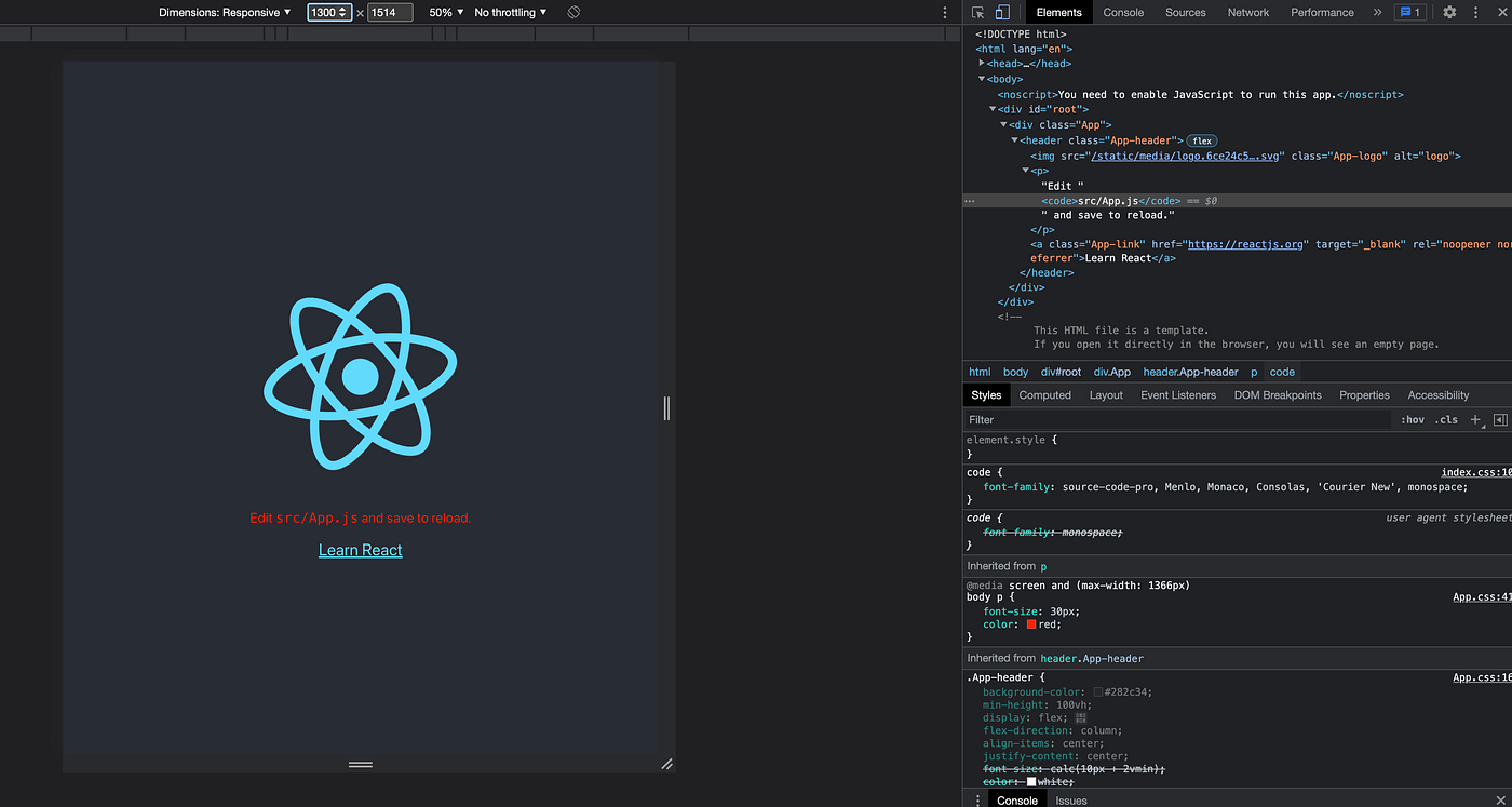
You can adjust the styling of the application using media queries under any resolutions!
- CSS: Flexbox and Grid
Other important tools to make an app responsive are Flexbox and grid.
Flexbox aims at providing a more efficient way to lay out, align and distribute space among items in a container, even when their size is unknown and/or dynamic.
Grid, on the other hand, is a two-dimensional grid-based layout system that splits the website into equal “boxes” and allows developers to specify how many “boxes” one container can use.
Flexbox layout is most appropriate to the components of an application, and small-scale layouts, while the Grid layout is intended for larger-scale layouts.
To demonstrate the power of Flexbox and Grid, we will create 3 boxes in our app.
In App.js file, add the code below:

<img src={logo} className=”App-logo” alt=”logo” /><p>Edit <code>src/App.js</code> and save to reload.</p><div className=’responsive’><div className=’box’></div><div className=’box’></div><div className=’box’></div></div>
Then in App.css, add the following code:
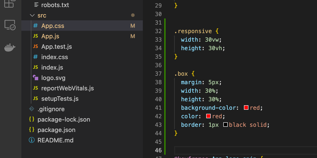
.responsive {width: 30vw;height: 30vh;}.box {margin: 5px;width: 30%;height: 30%;background-color: red;color: red;border: 1px black solid;}
Now the app should have 3 boxes:
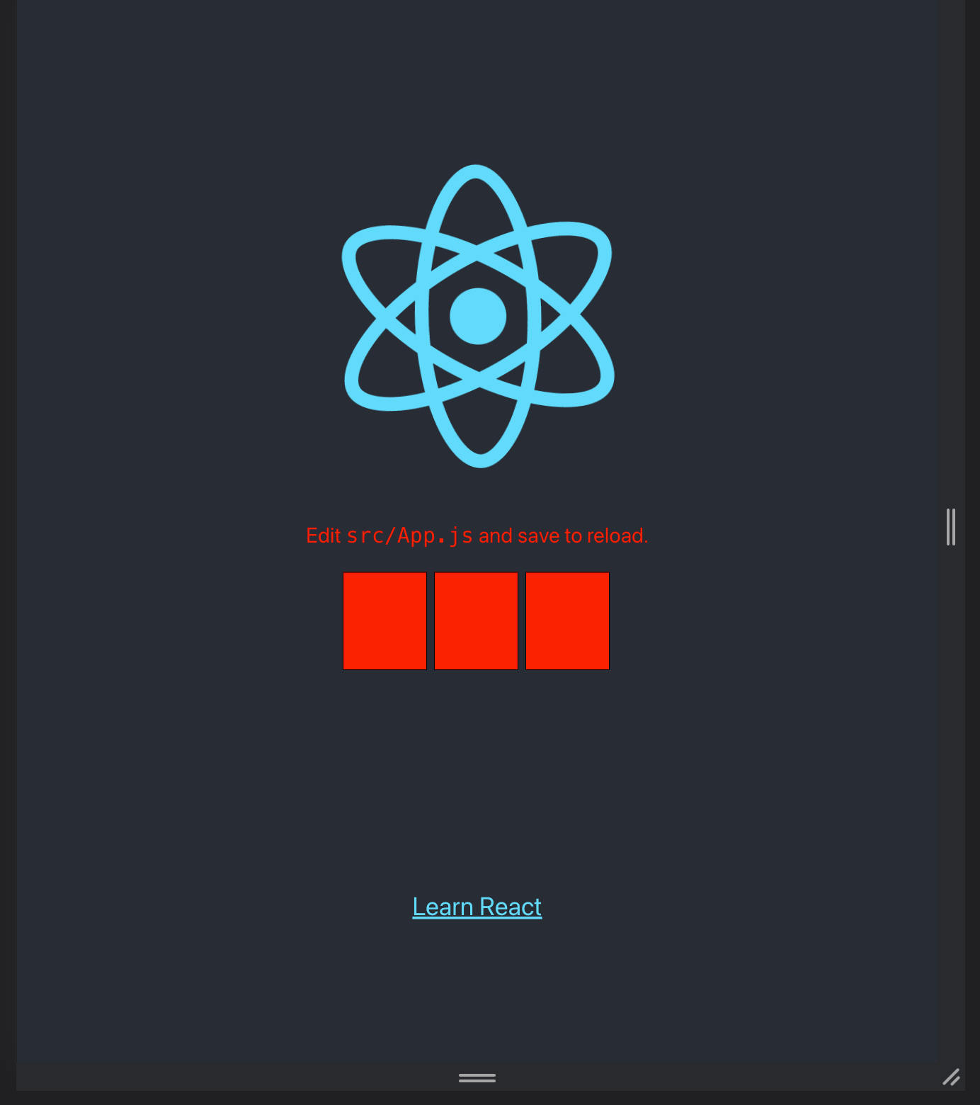
Boxes in the app
To add Flexbox or Grid to the component, we simply add display property to the class:
.responsive {
display: flex;
/* display: grid; */
}
Flexbox
Flexbox has the default row direction. All the boxes should be aligned horizontally. You can use the flex-direction property to change the direction.
Here are most of the most common properties used for Flexbox:
justify-content: defines the alignment along the main axis.
align-items: defines the default behavior for how flex items are laid out along the cross axis on the current line.
flex-wrap: allows the items to wrap as needed when all items do not fit in one line.
Here is the complete guide about Flexbox properties.
Grid
Similarly, once you add display: grid, you can use grid properties to adjust the positions of the boxes in the container.
Properties to use:
grid-template: defines the columns and rows of the grid with a space-separated list of values.
gap: specifies the size of the grid lines.
Here is the complete guide on Grid properties.
Example styling:
.responsive {display: flex;flex-direction: row;justify-content: space-evenly;align-items: flex-start;}/* or */
.responsive {display: grid;grid-template-columns: 1fr 50px 1fr ;gap: 15px 10px;}
Play with different combinations. You can accomplish most stylings needs with these tools.
- Typography
Most developers default to pixels for their font size unit. While it’s fine when you know exactly what your website resolution is, a responsive website should have a responsive font.
One way to adjust the font size is to use the media queries mentioned above and define the font size based on different breakpoints. This gives you a lot of precision and allows you to justify the fonts based on each device. While this approach can help you address the problem, it requires you to decide the font and breakpoint beforehand and it’s not flexible enough.
What we can do instead is to use the relative font size units: rem or vw.
Rem unit sets the font size relative to the root container and VW unit sets the font size relative to the percentage width of the website itself.
body p {font-size: 3vw;}
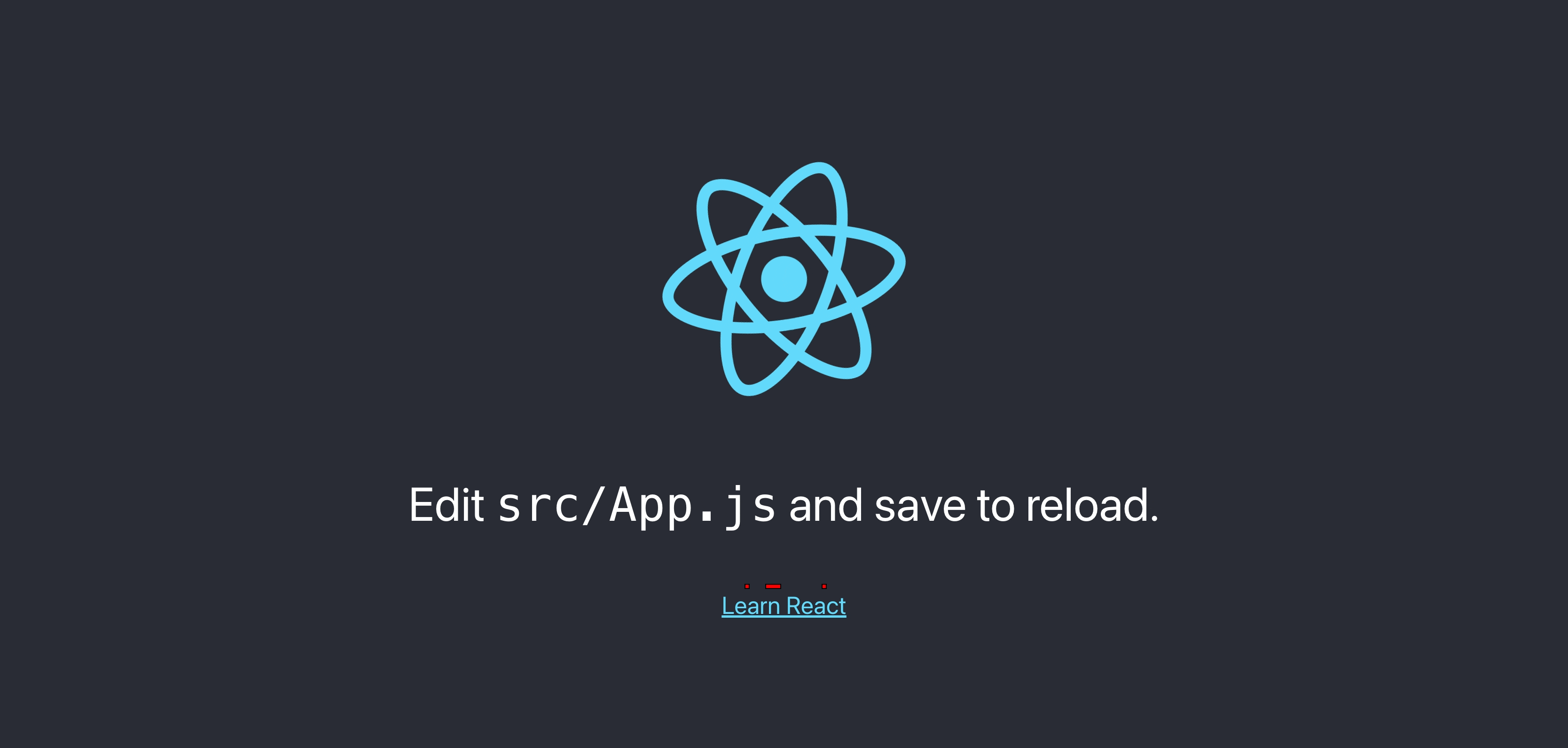
With this change, the font size will adjust itself based on device width.
Step 3: Check the responsiveness on real devices
You’ve learned how to make a website responsive and run the app smoothly in a local server. You can tweak the code all you want, but what’s most important is that it runs on real devices.
During the development phase, we can right-click -> inspect. Once the coding is done, however, we need to use a responsive design checker like BrowserStack to test the app properly.